Sales Pieces are promotional flyers used to explain, promote, or refer to a particular product or service. The following examples are specific to the Houston Chronicle which used them to great effect. We will see layouts using co-branding as the Houston Chronicle promotes another “brand” and we will see others being used as reference material.
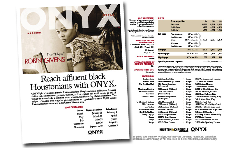
ONYXStyle is a lifestyle publication for upscale African-American Houstonians. Each issue focuses on fashion, art, entertainment, profiles, and events. Prices run from $1,500 to over $7,000 per ad and an explanation on demographics and coverage area.

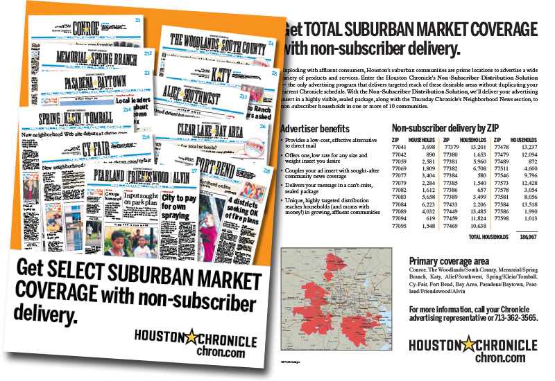
LOCALIZED NEWSPAPER SECTIONS It’s important to keep the numerous points of information separated and formatted to be easily understandable at a glance. While the large and crowded front page displays EVERY local newspaper section, the back is separated into six sections to easily REFER to the incentives, benefits, distribution, demographics, contact info, and the branding.
Contrasting with the clutter of most pieces, the LUXURY LIVING section within the premier GLOSS publication has a simplified, symmetrical layout. The simple design is justified by printing on fibrous matte cardstock paper.

Most Sales Pieces are Letter-sized (8.5×11 inches). Using a folded tabloid-sized sheet (11×17 inches) creates a 4-page layout. Note the crammed the content on the last page while plenty of room exists throughout the first 3 pages.

This is a rate sheet with a list of publication dates on the back. Oftentimes the amount of content – especially in a table grid might be better presented in a landscape format. In this case the Houston Chronicle was providing this information on the behalf of an HGTV publication and as such was co-branded. I decided to go with a design and color scheme (and a landscape orientation) to further differentiate from the Houston Chronicle’s branding. And I thought the spring-like colors brightened the dry content.

This piece has a portrait orientation on the front while the back has an landscape orientation. This configuration is acceptable when the layout is a flyer. Other pieces might be more problematic and care must be taken.

As a designer the layout should be created to make it as easy as possible for the reader to grasp the idea. In this case, the clever headline is replaced by the most appealing research: Reach over 60% of consumers in your community. Short, to-the-point copy in manageable paragraphs with supporting easy-to-understand data is laid out on the page. To make this easier, branding guidelines and templates are used to make this easier – note the logo anchoring every page with specific a tendency for a large front page graphic with large copy, an incentive, a benefit, supporting research, price (not applied here) and contact info.

Note the differences and similarities in the branding template between the Sales Piece below to the one above. This piece is also part of a much bigger campaign to push real estate products and services.

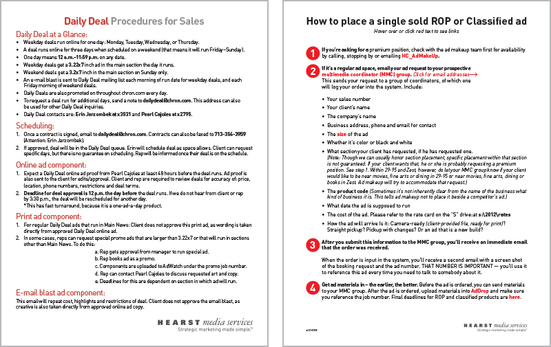
In putting together an effective Procedure Manual, it is essential to focus on the specific steps for employees to accomplish a particular task. A clearly legible and orderly set of instructions and a convenient configuration of those steps need to be defined. Below are step by step instruction in placing an ad into the Houston Chronicle newspaper. Not only did I design this manual, I also performed as project manager. As the department preferred annotated PDFs the variable information (facts that may change over time) were put in annotated form.

To view the annotated PDF of How to place an ad in GLOSS, download by clicking: S1211419_GLOSS_fulfill
Media Kits are a package of information about a company given out to media workers, a Rate Sheet will outline the pricing schedule, and both may contain a cautious amount or an extravagant of information. This rather simple one for 29-95 Magazine was initial sent out as a full screen “presentation” PDF that transitioned from the pages in slideshow fashion. A white, printed version was also available:

To download the presentation PDF of the 29-95 Media Kit, (with black background) click: 29-95-MediaKit