ADJACENCIES
Adjacencies are advertisements that emphasizes adjacent content. The trend has been to establish a connection with highly reliable, newsworthy content to an advertiser. As a designer I have been asked to come up with adjacencies to promote ad placements within the Houston Chronicle. The challenge has been to balance blatant advertising with the layout of the editorial articles.
AMEGY BANK Front-page strip ads have been markedly ubiquitous in recent years throughout the newspaper industry. Here is a rather simple and effective strip ad on the front page of the Houston Chronicle which essentially contains the headline. Inside the paper is a full-page ad which explains the incentive.

BANK OF TEXAS In the following example, the Market Summary page leaves little space for a sponsorship ad, but I was able to find a 3-column x 1-inch and a 1-column x 1-inch in the folio. As part of the sponsorship package we also included a standard quarter-page ad – seen here on the Jump Page.

HOMESULATE These are actually two “creative shape” ads, the one on the left is checkerboard while the one on the right is a page sponsorship. Creative shaped ads can be done within the grid or “over the grid” meaning that the editorial content has to re-flow around the ads. Of course, this makes it harder for everyone else involved in creating the page. These two layouts are within the grid. The checkerboard layout is simply a series of 3-column x 5-inch ads. The page sponsorship is simply a 6-column x 6-inch ad anchoring the page while a 6-column x 2-inch ad spans the top. This makes the the ads easy to place without further management from Preflight, Editorial, or the Printer.

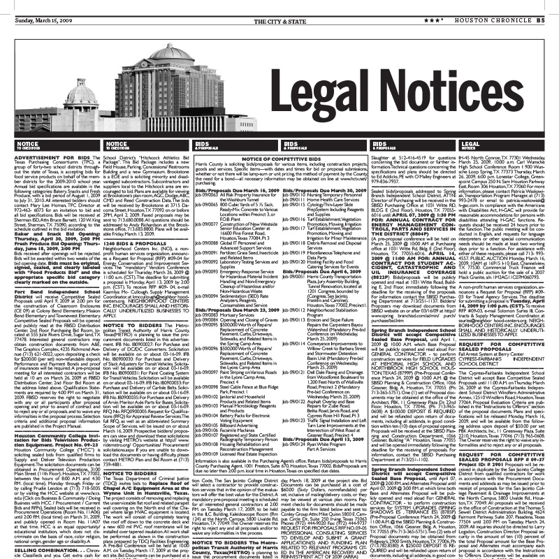
NEWSPRINT BANNERS Banner headings serve as a reference point, and are often overly designed. Being in downtown, I took a photo of the Harris County courthouse from the roof of the parking garage and clipped out the surrounding skyline. A high-contrast grayscale treatment of the photo along with the large text connotes the legal content on the page.
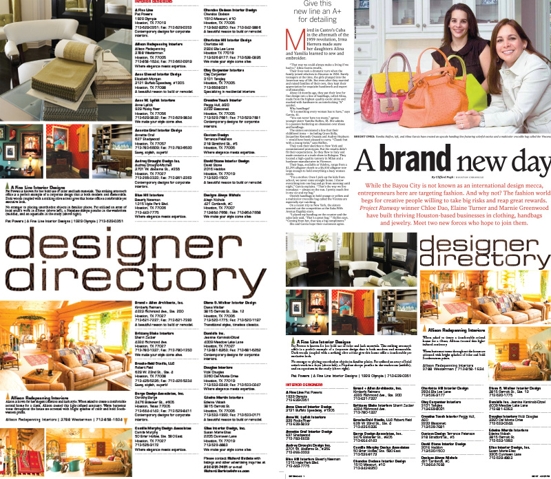
DESIGNER DIRECTORY This adjacency illustrates line-ads, similar to classifieds, in which the advertiser purchases a listing – about 5 lines. The listing is placed adjacent to a short piece accompanied by a set of photos. On the left there is a full page mock-up, while on the left there is a half page adjacent to an article.
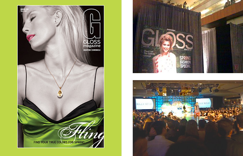
Often, while creating any sort of design, a promotional piece is also constructed to explain the offer. The Design Directory posted above is explained in this flyer that shows: an example, the publication date, benefits, and contact information.

To see more concerning sales pieces and corporate communications please see COLLATERAL.
POINT-OF-PURCHASE
Point-of-Purchase pieces are marketing materials physically placed next to the merchandise that it is promoting and are generally located at the place where the purchase decision is made. These layouts are actual physical signs and as such should remain simple, and any images and headlines remain short, bold and to the point.
The provided excellent photograph of TONY BENNETT was incorporated into the point-of-purchase branding and the color was picked from the background. To make the color emulate the carpet of the photo I added noise and a rendered a lighting effect in Adobe Photoshop.

I cannot overemphasize how bold POPs, signs, and outdoor ads need to be designed. Just like very small ads, they ultimately exist in a very cluttered environment. Please note the attention to kerning, leading, and contrast – even the dollar sign has been thoughtfully superscripted and confidently balanced.

— PAGE UNDER CONSTRUCTION. PLEASE SEE EXAMPLES BELOW AS MORE ARE BEING ADDED —
LARGE FORMAT GRAPHICS
Akin to Point-of-Purchase layouts, environmental graphics – like this 8×10 foot booth is needs to take into account to how the audience will receive the information. This booth serves as a backdrop for presenters that talk one-on-one with potential clients. Note that each “square” spans nearly a foot across – the same as the POPs above.

PACKAGING

Packaging design for a promotional piece (breath mints).
CD PACKAGING

Packaging design for a music CD.
BILLBOARD

Indoor billboard for 29-95 Magazine.
PLAQUE

Simple, award-like design for “best of” plaque; framed and presented to winning businesses.
EVENT GRAPHICS
The problem at our annual Fashion Show Primavera was that the new width of the magazine did not conform with the dimensions of our existing sign hardware. To crop the cover would lose elements of the cover so it was shrunk to fit. The color was chosen to match and thus enhance the display.
VECTOR ILLUSTRATION

An example of vector-based illustration. The architect supplied image was dropped into a layered array of abstract motifs to convey a pampered, luxury downtown living.
PHOTO MANIPULATION

An example of photo manipulation. The client supplied image was placed into another background and the car was changed to yellow.
FLYER AND NEWSPRINT AD

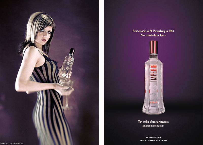
UPSCALE ADS

RECRUITMENT BANNER

RECRUITMENT BANNER

RECRUITMENT BANNER

DOUBLETRUCK
ADSHAPES
ADSHAPES
POINT-OF-PURCHASE

EMAIL

NEWPRINT PAGE DESIGN

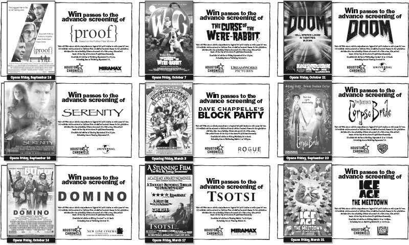
MOVIE CO-OP ADVERTISING

POINT-OF-PURCHASE

BANNER AD

One of the quickest – and poignant – designs I’ve done was this “footer” for the Hurricane Ike edition of the Houston Chronicle.
Since I had volunteered to stay at the Houston Chronicle during the hurricane I received a frantic call from the sales rep – who was on her way out of town to evacuate. Kroger wanted to place an ad on the front page that notified the public that they would be helpful throughout the hurricane. Of course we could not foresee if they would be “Open To Serve Houston” or if they would even have the inventory for “Anything You Need” for the hurricane. My initial proof of “Here For You, Houston” sent a scant 8 minutes after the phone call began and was revised by Kroger about 5 minutes later to “Proud To Serve Houston” with the URL added.
I got the call at about 4:20 p.m. and was completely done by 4:40 p.m., including the one revision, all procedural criteria, and the final output as a PSTI file.
EMAIL

BOOKLETS
FORMS

JUMPING THE GUTTER
TEMPLATE LAYOUT for CUSTOMER EDITS
FRAMING

NEWSPRINT